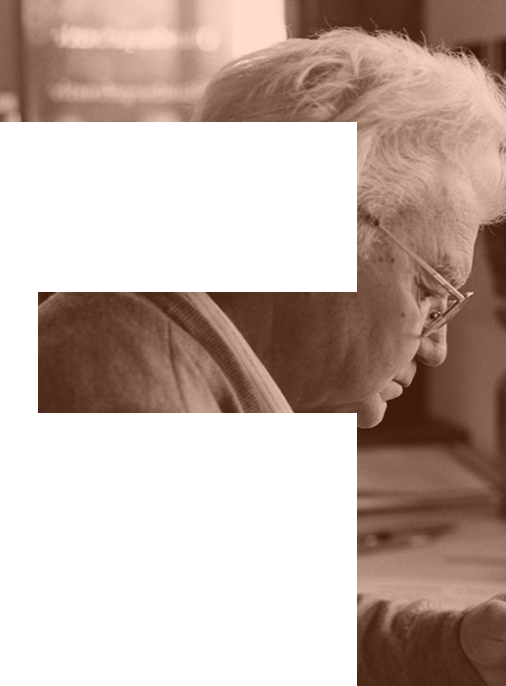
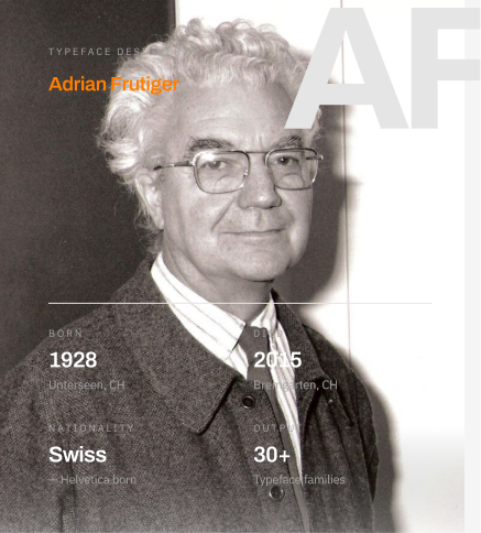
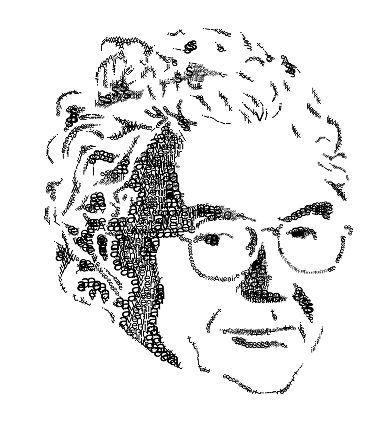
Adrian
Frutiger
Swiss typeface designer who revolutionized modern typography through his systematic approach to letterform design and unwavering commitment to legibility.
His work established fundamental principles for creating typefaces that serve the reader first—a philosophy that continues to shape digital typography today.
Clarity
Every letterform must communicate its intended character without ambiguity. Form follows function in service of the reader.
Legibility
Typography exists to be read. The designer's role is to ensure text can be absorbed quickly and effortlessly.
Neutrality
The typeface should not impose character. It provides a vessel for content, allowing meaning to emerge from the text itself.
System
Comprehensive type families with coordinated weights and widths create visual harmony across complex information hierarchies.
Why Influential
Adrian Frutiger's influence on typography extends far beyond the individual typefaces he created. He established a methodology for designing comprehensive type systems that could adapt to diverse applications while maintaining visual consistency.
His approach to type design was fundamentally democratic. Frutiger believed that typography should serve the reader, not the designer's ego. This philosophy led him to create typefaces that were neutral yet distinctive, functional yet beautiful.
The systematic nature of his work—particularly evident in Univers, his first major typeface family—revolutionized how designers thought about type systems. Rather than designing individual styles in isolation, Frutiger conceived entire families with coordinated weights and widths from the outset.
TIMELINE
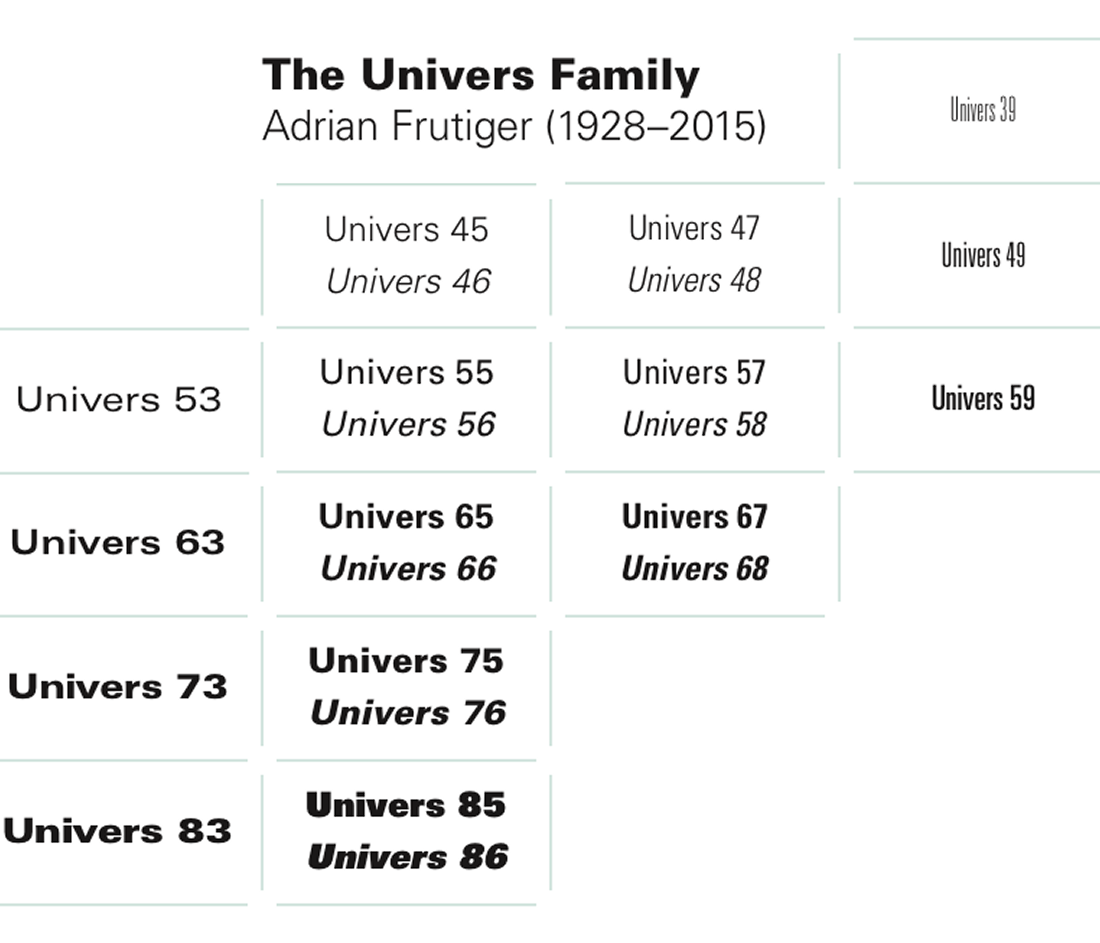
- 1957 Univers Type System — Released the Univers typeface family with 21 fonts organized by a systematic numbering scheme. This revolutionary approach to type family organization influenced all subsequent systematic typeface development.
- 1968 OCR-B — Designed OCR-B, a typeface optimized for optical character recognition that remained legible to human readers—a landmark achievement in balancing machine and human needs.
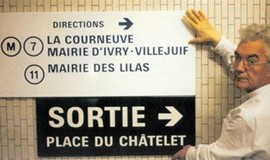
- 1976 Frutiger Typeface — Created the Frutiger typeface for signifying signage at Charles de Gaulle Airport. The design combined exceptional legibility with humanist warmth, becoming one of the most widely used typefaces in the world.
- 1997 Type Foundry Legacy — Through decades of work with Deberny & Peignot and later collaborators, established standards for digital type design that guided the industry's transition from metal to digital typography.
Univers
A systematic approach to type family design
When Univers was released in 1957, it represented a radical departure from traditional type family organization. Instead of arbitrary names like "Bold," "Condensed," or "Extended," Frutiger devised a numerical system that precisely indicated each variant's weight and width.
The base number indicated weight (from light to black), while the second digit indicated width (from ultra-condensed to extended). An odd digit meant a roman style, while an even digit meant a roman style, while an even digit indicated an italic—allowing designers to navigate the family with unprecedented clarity.
On Type Design
The Univers system transformed how type foundries conceived and organized typeface families. What began as an organizational framework that influenced every major type system developed afterward.
Modern digital type families with dozens of weights and widths trace their lineage directly to Univers. The idea that a typeface family should be planned as a coherent whole—rather than assembled piecemeal over time—is now fundamental to type design.
This approach also democraticized typography by making it easier for designers to understand and use complex type families. What made his systematic thinking the conceptual framework that influenced every major type system developed afterward.
Legacy and Impact
Foundation of Modern Typography
Frutiger's work established principles that continue to guide contemporary type design. His emphasis on systematic thinking, comprehensive families, and reader-centered design became the foundation for how we approach typography in the digital age.
The transition from metal type to photosetting to digital fonts might have been traumatic for typography. But Frutiger's clear principles provided continuity. His typefaces were among the first to successfully navigate these technological shifts while maintaining their essential character.
Wayfinding and Information Design
Beyond traditional publishing, Frutiger's influence extends deeply into environmental graphic design and wayfinding systems. His work at Charles de Gaulle Airport demonstrated that typefaces designed specifically for signage at distance and in complex information environments.
This principle—that specialized use cases observe specialized type design—influenced how designers approach large-scale information systems. Airports, transit networks, and civic infrastructure worldwide have adopted Frutiger's approach to creating clear, navigable typographic environments.
"Type is a beautiful group of letters, not a group of beautiful letters."
Digital Typography
As typography moved to digital platforms, Frutiger's systematic thinking became more relevant, not less. The need for comprehensive families that work across multiple weights, widths, and optical sizes intensified with advent of responsive web design and variable fonts.
His typefaces were among the most successfully adapted to digital media, maintaining their integrity across low-resolution screens and high-resolution displays. This adaptability stemmed from the fundamental clarity of their design—built on principles rather than ornamentation.
Educational Impact
Through his writings and teaching, Frutiger influenced generations of type designers. His books, particularly "Type Sign Symbol" and "The Development of Letter Forms," remain essential texts understanding the relationship between form and function in typography.
His approach to design education emphasized observation, systematic thinking, and respect for the reader. These values continue to shape how typography is taught and practiced worldwide.
Contemporary Relevance
In an era of infinite digital fonts and algorithmic type generation, Frutiger's principles remain prescient. The questions he asked—How can type serve the reader? How can systems be both comprehensive and coherent? How can design be both rational and human?—are as pressing now as they were in the 1950s.
Variable fonts, responsive typography, and multi-platform design systems all echo Frutiger's pioneering work with Univers. His legacy less a fixed set of typefaces, but in the way of thinking about typography that he represented.
Frutiger
Examining the characteristics that define humanist sans-serif design
Frutiger 45 Light
Frutiger 46 Light Italic
Frutiger 55 Roman
Frutiger 56 Italic
Frutiger 65 Bold
Frutiger 66 Bold Italic
Frutiger 75 Black
Frutiger 76 Black Italic
Frutiger 95 Ultra Black
Frutiger 47 Light Condensed
Frutiger 57 Condensed
Frutiger 67 Bold Condensed
Frutiger 77 Black Condensed
Frutiger 87 Extra Black Cond.
DESIGN CHARACTERISTICS
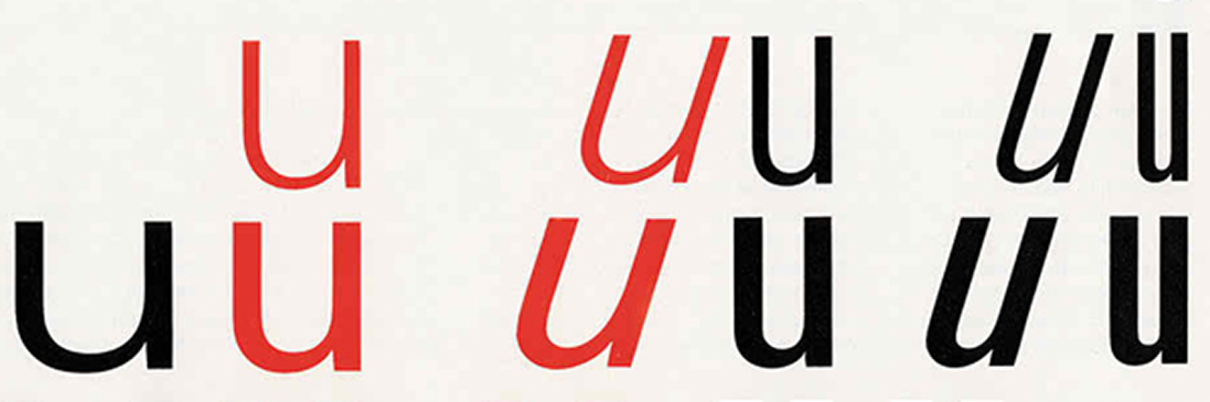
Open Apertures
Characters like 'a', 'e', and 'c' feature wide-open apertures that enhance legibility at email sizes and long-distance viewing.
Vertical Terminals
The stems of 'e' have clear, or cut vertical or near-vertical angles, creating a clean, modern aspect and aiding recognition.
Optical Adjustments
Curves extend slightly beyond the baseline and height to achieve optical balance. There's subtle adjustments ensure rounded characters appear the same as straight ones.
Stroke Modulation
While nominally a sans-serif, Frutiger exhibits subtle stroke contrast. Vertical strokes are slightly thicker than horizontals, echoing the characteristics of humanist handwriting.
KEY LETTERFORMS
Double-Story 'a'
The double-story lowercase 'a' connects the typeface to calligraphic traditions. It creates distinct character and aids recognition in text.
Two-Story 'g'
The two-story 'g' with its distinctive loops adds character and aids identification. Character and aids in distinguishing letterforms, improving readability.
Angled Terminal
The lowercase 't' features an angled terminal that creates visual interest and guides the eye through text, preventing monotonous presentation.
Design for Wayfinding
Originally created for the signage system at Charles de Gaulle Airport, Frutiger was designed to be legible at a distance and in motion. The typeface needed to work in challenging conditions—viewed from various angles, read while walking, and understood quickly by an international audience.
Those demanding requirements produced a typeface of exceptional clarity. What made it ideal for airport signage—its open forms, generous proportions, and distinctive characters—also made it supremely effective for general text setting.
The success of Frutiger demonstrates a key principle in type design: constraints breed clarity. By focusing deliberately on the specific needs of wayfinding, Frutiger created something universally useful.
Charles de Gaulle
Airport
A masterclass in typographic wayfinding
Typographic Hierarchy for Navigation
When Charles de Gaulle Airport opened in 1975, it required a wayfinding system that could guide millions of travelers through its complex architecture. The challenge: create signage legible quickly, understood internationally, and clear under the stressful conditions of air travel.
Frutiger's solution was a typeface specifically optimized for these conditions. Unlike existing typefaces designed primarily for print, the new design featured proportions calculated for viewing at distance and in motion. The typeface needed to work in challenging conditions—viewed from various angles, read while walking, and understood quickly by an international audience.
WAYFINDING SYSTEM PRINCIPLES
01
Clear Hierarchy
Information organized by primary, secondary, and tertiary user needs. Primary navigation aids first-time users through distinct visual treatment.
02
Consistent Spacing
Generous spacing between elements creates visual calm and scannability. The wide space is carefully designed as typography itself.
03
Systematic Color
Color employed judiciously to categorize information and destinations. A used systematically to categorize information, and destinations.
04
Universal Symbols
Icons are designed with same care consistency and systematicity approach as the typography. Symbols aid comprehension across language barriers.
05
Scalable System
The system works across scales from inches to meters without losing legibility. Proportions calculated to work at distance and in motion.
06
Temporal Logic
Information presented in sequence matching user decision-making process. Signs provide right information at right moment, avoiding cognitive overload.
Beyond the Airport
The success of the CDG Airport signage system established principles that have been adopted by transportation systems, hospitals, universities, and corporate headquarters worldwide. What made Frutiger's system remarkable was not the decorative use of typography, but the holistic approach to information design.
Frutiger understood that wayfinding is a temporal experience—travelers encounter signs in sequences, building a mental model of space. Information should be presented in order matching how users make decisions. Signs should provide right information at right moment, avoiding cognitive overload.
The system demonstrates that when typography is designed from first principles—serving user needs rather than designer ego—it becomes invisible. The best wayfinding doesn't announce itself; it works so well that users navigate effortlessly.